
Playing Cards
Role: Sole designer
Duration: 3 weeks
Skills: Figma, prototyping, user interface design
Overview
This mobile application offers an interactive card-playing experience, allowing users to add, delete, and rearrange cards with ease. Each action dynamically updates the total value, providing real-time feedback. Designed in Figma, the app leverages advanced prototyping techniques, multiple frames, and Smart Animate to create a seamless and engaging user experience.

The Story
This project was created for NMDE 203: Interactive II to explore Figma’s prototyping capabilities, with a focus on Smart Animate. Throughout the process, we learned to design multiple frames, move objects off-screen, and utilize Figma’s prototyping tools to create a seamless user flow.
Iterations and Sketches
To reach the final design of the cards, I played around with lots of different icons, colors, and placement. I found inspiration from numerous areas, but my primary inspiration was the queen card below with orange/pink colors and her holding a drink and wearing glasses.
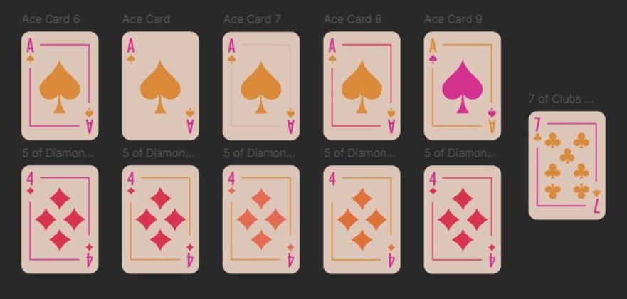


Final Set of Cards

Main Screens
Now that I had my final set of cards, I moved on to designing the screen around them. I wanted to rely on users’ past experiences and motions that they are familiar with. For example, to get rid of a card, you swipe to the left on the card, similar to how you would remove people on Tinder.
Since this is a mobile application, I prioritized ergonomic design by strategically positioning elements for easy reach and usability. Because most people are right handed, they will hold the phone in their right hand. This means that there should not be anything in the bottom right corner otherwise the user’s hand will cover buttons.
Error messages also appear along the way to help users. Instead of giving them all of the rules at once (which they most likely will forget), error messages appear along the way when relevant. For example, if you try to delete your last card, a message pops up reminding you that you must always have at least one card.


Prototyping
Once I had all the individual frames, I then had to connect them all. Using the prototyping “noodles”, I was able to create the user flow and specify specific transitions. Smart Animate is used to make the transitions smooth.
Project Reflection
I really enjoyed this project because it taught me a lot about the user interface controls. The advice, “Design, don’t decorate” really stood with me on this project, so I made sure that each visual had a clear purpose. Nothing is on the screen “just because”. This was a new thing for me to learn because in the past I would decorate to make something more visually appealing but thinking from the user’s perspective allowed me to focus on the functionality, as well as the aesthetics. In addition, I worked to make sure users could clearly understand an element’s affordances. For example, buttons are elevated with a drop shadow, then when they are disabled, their transparency turns to 50%, making them duller in comparison to their active state. Error reduction was used only when the user was about to make an error. This way, their screen was not bogged down with instructions or errors all the time. Only when the user could not do an action would an error message pop up. Finally, items were positioned ergonomically so that the user could interact with the application in a comfortable manner.
As someone who does not have a ton of design experience, I enjoyed getting to implement some design principles. With the inclusion of the plus on my add button, I used an isomorphic correspondence in the hopes that users could connect other applications with plus buttons to this one to simplify their experience. Repetition was also used in the card designs. While each is unique, they all share common colors and designs to make them cohesive, but still be identifiable on their own.
Overall, I am happy with how it came out. I am proud of myself for learning new prototyping skills such as on drag, animations, and components. If I were to improve for next time, I would like to do more critique with my friends and have them play around with the application and get their feedback on the functionality and visuals of the design.